身旁許多朋友都認為SAS所繪製統計圖不美麗,語法也不好寫,許多年前新增的「ODS GRAPHICS」系列我想就是改善這些狀況,經過這幾年的強化,其功能和精美程度以非吳下阿蒙。
最近幫朋友做了一份資料(可惜無法把結果與大家分享),這份報告中使用了數個統計圖呈現結果,雖然不能將結果分享出來,但統計圖的語法倒是可以和大家切磋,希望能讓使用SAS的朋友從中獲得一些想法。
ODS GRAPHICS在網路上很容易找到說明,所以這次不會花太多時間說明每一個語法的功能,倒是大家可以實際操作一遍,會比較有感覺。
這次分享的是「熱圖(Heatmap)」,圖形結果如下:
")
依據慣例先建立範例檔案,於【程式01】
/*程式01*/
data heatmap_1;
do i=1 to 200;
do year=2012 to 2017;
do week=1 to 7;
if uniform(1)>=0.3 then output;
end;
end;
end;
run; |
SGPLOT的熱圖部分,需要事先準備好「可以畫圖」的資料,所以【程式02】將原始資料先轉為可繪圖的資料。
/*程式02*/
proc sort data=heatmap_1;
by year week;
run;
proc freq data=heatmap_1 noprint;
tables year*week / sparse out=heatmap_2 (where=(percent^=.)) outpct;
run;
|
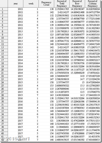
heatmap_1如下圖:
先設定自訂格式
/*程式03*/
proc format ;
value fweekday 1="一" 2="二" 3="三" 4="四" 5="五" 6="六" 7="日";
run; |
【程式04】最後為熱圖的程式。
/*程式04*/
ods html gpath = "e:\temp\" image_dpi=300 style=htmlblue;
ods graphics on / reset=all reset=index noborder height=6in width =6in
antialiasmax=10000 imagename = "圖" imagefmt =png ;
ods results off;
proc sgplot data=heatmap_2 ;
format week fweekday.;
heatmap x=year y=week / freq=count discretex discretey colormodel=(white red);
styleattrs backcolor=white;
gradlegend / title='案件數' ;
text x=year y=week text=count / textattrs=(size=6pt color=dark_gray) ;
xaxis label="年度";
yaxis discreteorder=data reverse label="星期";
title j=c h=14pt '歷年案件數';
run;
ods results on; title;quit; |
「ods html」和「ods graphics」可讓統計圖直接輸出為檔案。
「heatmap」為繪圖的主要語法。
「gradlegend」修改熱圖旁的圖例說明(但似乎不能再改更多了)。
「text」新增統計數字於熱圖上,這裡要設定正確,不然會出現圖和數字沒有關係的狀況!
「xaxis」修改X軸。
「yaxis」修改Y軸。
以上就是本次的分享~
熱圖需SAS 9.4M3版本。
-------相關連結------